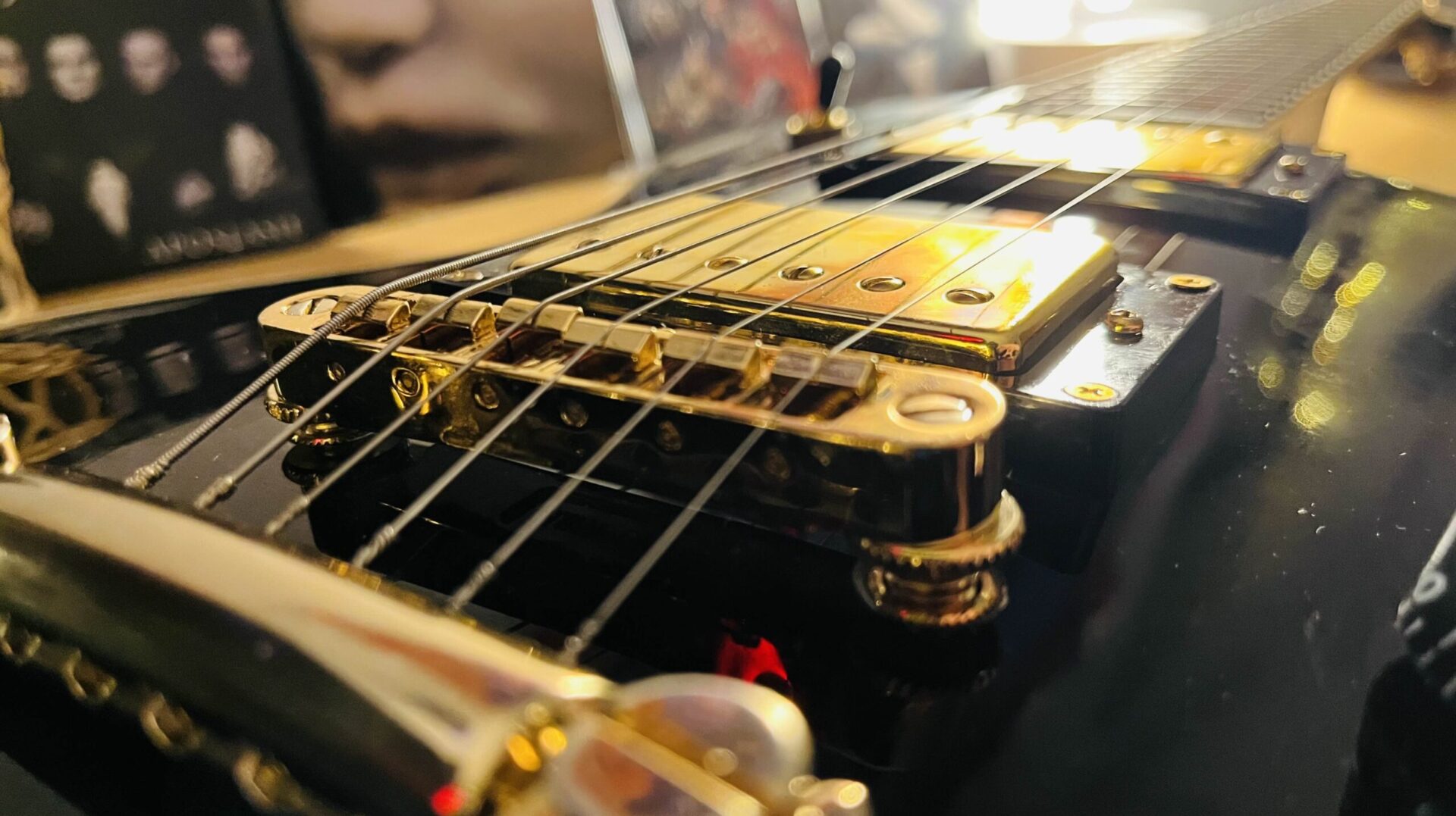
I’ve just done performance and visual Updates as you can see.
I hope you like it! 🖤🔥
Here are the results:
After:
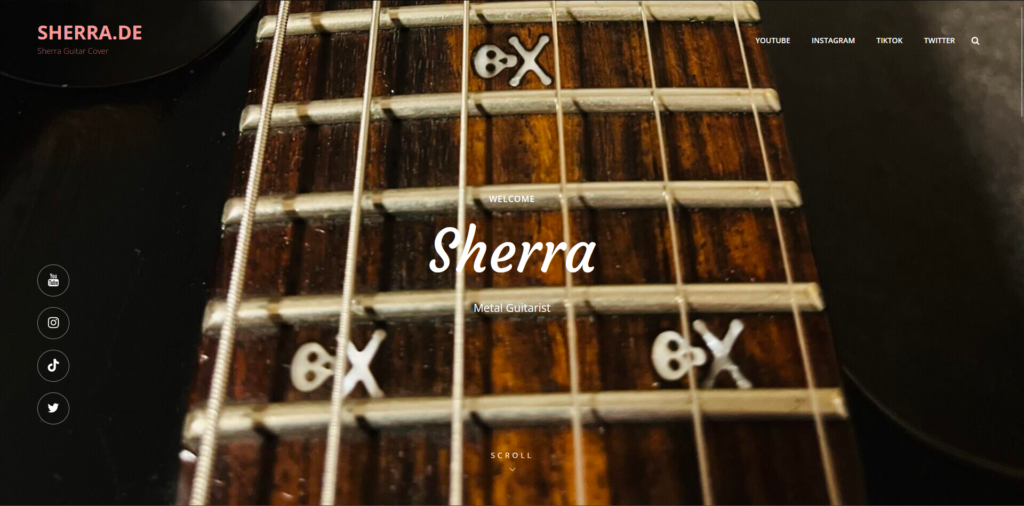
Header Section

Introduction Section
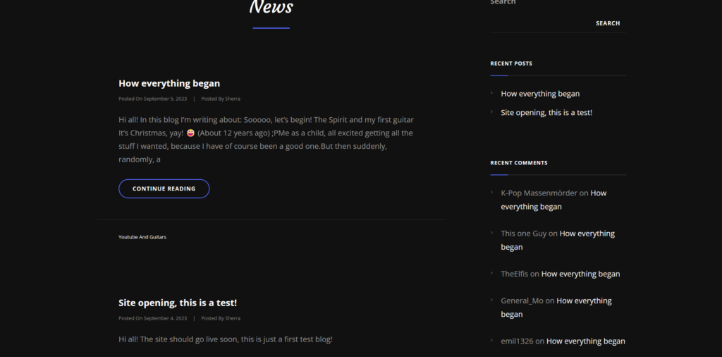
Content Section
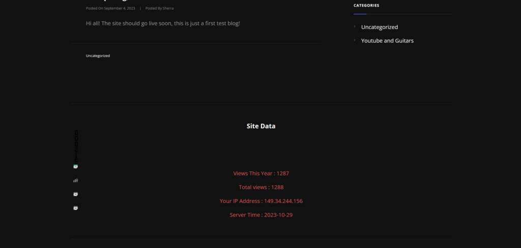
Data Section
Before:

Header Section
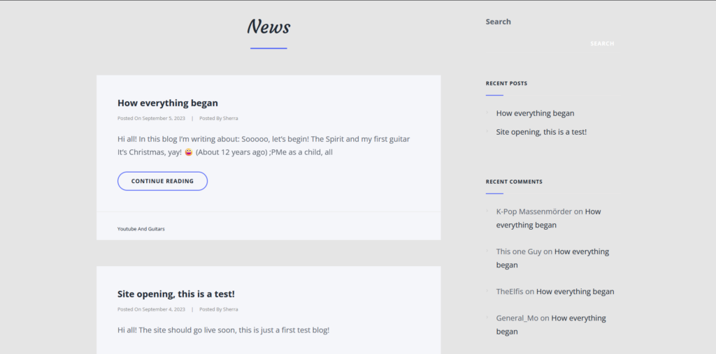
Content Section
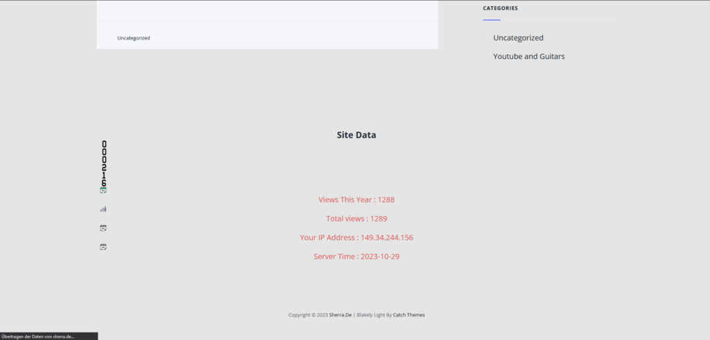
Data Section
So what are the changes?
- The header GIF which massively consumed bandwith has been replaced with an image.
Which lead to: - Greatly improved bandwith
- The site generally has been turned into black, because black is better and black is more metal.
- Introduction section is now on the frontpage
- The original introduction from the top right has been replaced by links to my accounts
- The Header section has been made more slim (Like we say in german: less is sometimes more)
Thank you for checking this out!
Wish you a nice day~ 🖤💕🤘🏻
